Blog posts
New font: Selawik Variations by Microsoft
Posted 8 December, 2016
Selawik is an open source typeface from Microsoft, designed in-house by Aaron Bell. Intended as a substitute for Microsoft Segoe in WinJS and other platforms where a Windows-style appearance is needed, it was released in April 2015 in Regular and Bold weights under the SIL Open Font License.
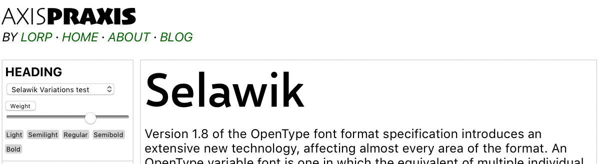
Now Microsoft has released Selawik Variations, a new variable version of the typeface with a Weight axis. The open license remains as before, permitting its installation on Axis-Praxis — you’ll find it in the More Fonts panel.
There’s a lot more to Selawik Variations than meets the eye, however.
Internal state reporting
The most innovative aspect of the font is that it uses TrueType hinting to let the font explain what’s going deep inside the rasterizer, via glyphs specially constructed and coded for the purpose. That might sound strange, until you recall that fonts embody programs and other finite state machines, yet — unlike most familiar programming systems — lack a clear method of reporting internal states. For convenience, these special glyphs are invoked by OpenType ligature substitution. The key to these substitutions is found in the font’s README file:
\axis1Shows the normalized coordinate on the wght axis for the currently selected instance (e.g. 1.0 for bold, -1.0 for light, or something in between).\axis2Shows 0 because this font doesn't yet have a second axis.\axis1hexSame as\axis1but in hex.\axis2hexSame as\axis2but in hex.\pointsizeShows the point size passed to the TrueType rasterizer. Note that depending on how the application calls the rasterizer, this may not be what you expect - e.g. on Safari on MacOS, this is always 1024.\ppemShows the pixels per em passed to the TrueType rastersize. Note that depending on how the application calls the rasterizer, this may not be what you expect - e.g. on Safari on MacOS, this is always 1024.\ttversionShows the version of the TrueType rasterizer.\ttmodeShows the current TrueType rasterizer mode flags.\boldtestA glyph to help you detect artificial emboldening. The glyph has a vertical bar and a circle. The vertical bar's weight varies with the weight of the rest of the font: it gets bolder at bolder weights, lighter at lighter weights. The circle changes weight (and size) in opposition to the rest of the font: lighter at bold weights and vice versa. Thus, if you use this character and see both the circle and bar look bold, you're not looking at a true bold instance, but an algorithmically emboldened one.\familyShows the family name of the font.\versionShows the version of this font
What this means is that to get a “report” on the current state of the first axis in the font,
you simply type “\axis1” and set that string in the font itself.
As long as the liga feature is active, the substitution takes place. In Axis-Praxis the liga feature is always on, by virtue
of text-rendering: optimizeLegibility in the CSS,
so you can simply type those strings into Axis-Praxis textboxes to reveal what’s happening live inside the rasterizer.
Slide the Weight slider left and right to see the axis value reported as you slide.
As the README explains, this is the normalized internal coordinate. For example, an axis
that runs from a minimum of 100 via a default of 400 to a maximum of 700 has normalized values of -1, 0, and +1 respectively;
a value of 550 (being half way between 400 and 700) results in a normalized internal coordinate half way between 0 and +1, thus +0.5.
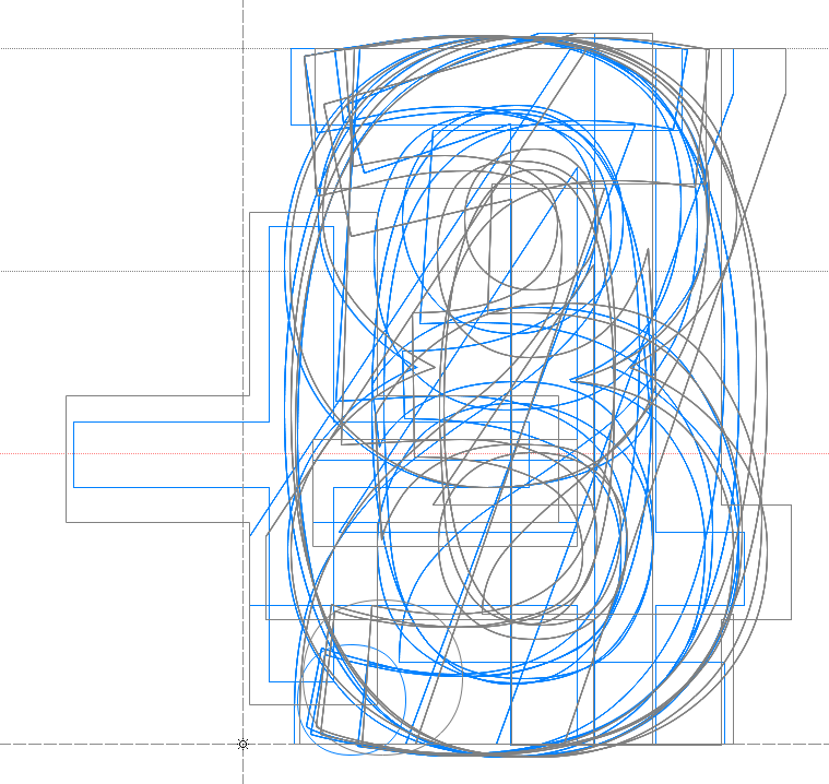 _The ‘dbgaxis1’ glyph in Selawik Variations contains 45 components that TrueType instructions rearrange into a decimal readout
This magical display, where the correct glyphs report the current internal value, happens thanks to TrueType instructions and components. The first step is to retrieve the state of the axes: the new GETVARIATION instruction is used for that. Then we need to construct the value by manipulating components. Let’s look at the ‘dbg_axis1’ glyph, designed to display values from -1.0000 to +1.0000. It is a composite glyph of 45 components: 4 sets of the digits 0 to 9 for the fractional part, one set of the digits 0 and 1 for the integer part, and the glyphs ‘+’, ‘-’, ‘.’. After the axis value has been retrieved using the GETVARIATION instruction, this binary value is turned into a decimal string string of 5 decimal digits and punctuation. To make this decimal number visible, TrueType instructions collapse all the unused glyphs onto single points, resulting in a nice rendering of the axis position, e.g. ‘+0.3742’. The components being the existing digit glyphs, the final readout renders with the current weight.
This remarkable use of TrueType hinting is the work of long-standing Microsoft font rasterizer wizard, Greg Hitchcock. Regarding the ‘dbg_axis1’ glyph he writes:
It might be worth noting why I created this glyph (and the hex version). Font hinters can use the GETVARIATION instruction to fine-tune an instance. I thought it would be useful when proofing fonts to see the GETVARIATION values where potential problems exist, so that corrections could be added to the hints. I added the hexadecimal version to make sure there were no rounding problems.
Note: Similar outline-collapsing techniques were used in the early days of TrueType in complex fonts that needed to be simplified at low resolution, such as David Berlow’s Augsburger Initials.
Overlaps
For many years in font production it has been recommended practice to remove all the overlaps from fonts before shipping. Although fonts with overlaps work fine in many situations – even Times New Roman’s ‘Ç’ and ‘ç’ have overlaps – there remain certain places (in old PostScript printers, or when applying a “stroke” effect) where glyphs with overlaps don’t render as intended.
Yet while the typeface is still being designed, overlaps are very useful. They make it much easier to copy and paste elements between similar glyphs. And they make interpolating instances between extremes much more powerful – interpolating works over a much wider range before manual edits are needed. It’s this latter factor, the benefits of overlaps in interpolation, that makes them interesting for variable fonts. A variable font without overlaps will in general be less versatile than one with.
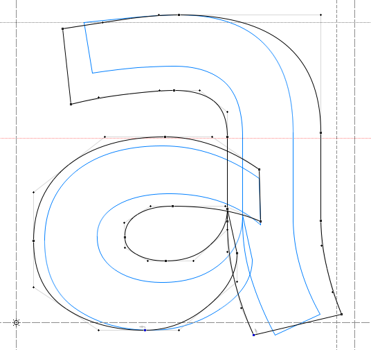 The “a” glyph in Selawik Variations, showing the overlaps that help it morph smoothly between Regular and Bold.
Type designers were pleased to hear, therefore, when it was announced that overlaps are explicitly allowed in OpenType 1.8 fonts. Selawik Variations uses overlaps extensively, and will be a great test case for the new requirement for systems to handle overlaps nicely.
STAT table and other new OpenType 1.8 tables
The STAT (style attributes) table is new to
OpenType with Version 1.8. It’s intended to let the font sit happily alongside other fonts in the same
family, notably older fonts which are not variable, and italic designs that exist in a parallel variable font.
Selawik Variations is one of the first fonts to contain the STAT table. Since the STAT table is
required in an OpenType 1.8 Variations font, it is therefore also one of the first fonts to conform to the new specification.
You can dump the STAT table using an up-to-date version of TTX.
The font also contains the new HVAR table, which varies horizontal metrics, and its GDEF and GPOS tables are new formats that allow kerning to vary across the axis ranges.
VTT hinting source
As a bonus, the font includes the complete VTT hinting source code for the font. Warning: The advanced level
magic that makes the outlines collapse, is written directly in TrueType’s “assembler” language (for example, see
fpgm function 159) so is definitely not for beginners.
I asked Aaron Bell some questions about the design of the Selawik typeface.
Laurence Penney: I’m writing an article for Axis-Praxis about Selawik, whose variable incarnation I’m pleased to host. I really like the design, and I wondered if there was any more info that you can share about the typeface — more than is on GitHub, I mean. And is it a design idea you’ve been intending to develop for a while?
Aaron Bell: Glad to hear that you like my little Selawik project! It was a good project to work on, though challenging. The design for Selawik is partially based on an earlier in-progress design of mine, but was heavily changed due to enforced metrics alignment with Segoe UI. I can say I understood well the struggles of Monotype in adapting Arial to Helvetica’s metrics!
So basically I needed to make a typeface that lived in the same universe (humanist sans-serif) as Segoe UI but was sufficiently different from Segoe UI for an ordinary person to recognize, while maintaining the metrics. I gave up on the ‘l’ :). For better or worse, the need to differentiate Selawik’s design introduced a number of quirks to the design to make it more noticeably changed. Some are not terribly successful — like the angled top on the arm of the ’k’ which I will likely remove — and some I think work well, giving Selawik more warmth than Segoe UI.
LP: It’s interesting to see how the TTF makes heavy use of overlaps. At first, while watching how the font morphs, I assumed it used intermediate masters. But I checked and saw that it’s a central master with extremes, helped to morph smoothly by use of the overlaps. Have you run into any problems caused by the overlaps?
AB: We haven’t run into any issues with preserving overlaps yet. However, the reason they're there is to simplify the toolchain as overlaps are practically mandatory for East Asian fonts. There’s many characters where, at lighter weights, strokes don’t touch, but at heavier weights they do. While we could use variation tables to switch out the non-touching for a touching version, it just makes more sense to preserve outlines.
LP: I wonder, have you done any tests about the space-saving potential of allowing overlaps while maintaining design integrity during interpolation?
AB: We haven’t done any tests to determine the file-size savings for preserving overlaps, but I expect that it could be quite significant depending on a designer’s use of components.
LP: Why the name?
AB: The name is a bit of a funny story. I was hunting around for possible names for the typeface when Si Daniels [longstanding Microsoft typography personality] jokingly said, “why don’t you find another city in Alaska to name it after?”, referencing our recent release of Sitka. I figured that was as good a starting point as any and soon found the name Selawik up in NW Alaska — I especially liked how it has some similarity in sound to Segoe, but is clearly different.
LP: The date of 4/4/2015 is inside the Glyphs file. Is this the date of its first open source release?
AB: The font was first available as an ‘open source’ binary file on April 10, 2015, and the sources went online in December 2015.