Blog posts
Article: GX Variations, a typographic revival
Posted 14 November, 2016
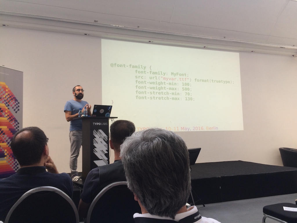
This article was written as a review of a talk given by Behdad Esfahbod of Google at the TYPO Labs conference in Berlin, May 10, 2016. Since then it became clear that the term ‘GX’, widely used in this article, is being dropped and we now speak of ‘OpenType Variations’. Behdad’s talk can be watched online in full: OpenType GX: an exploratory proposal (30 mins).
There came a wistful voice from somewhere in the middle of the auditorium: “I haven’t seen that in over 20 years!” We all turned to see who’d spoken. It was Tom Rickner, creator of Buffalo Gal, the font we’d just witnessed being put through its paces on the big screen. There was hardly a dry eye in the house…
The occasion was the first day of the small but perfectly formed TYPO Labs conference, which preceded TYPO Berlin in May. As usual (for a type tech gig), several sessions demo’d impressive approaches to interpolation in type design. But this was something more: a serious proposal from Behdad Esfahbod of Google to reintroduce interpolation for font users and front-end developers (not just font makers) to play with.
TrueType GX was part of an ambitious overhaul of the Macintosh graphics systems in the mid-1990s. The typographic aspects elegantly handled ligatures, small caps and alternates. (Adobe and Microsoft would catch up years later with OpenType.)
But there was one more aspect of GX that excited font geeks. This was GX variations, Apple’s answer to Adobe’s Multiple Master interpolation. Like MM fonts, one file represents all the weights, widths and optical sizes of a typeface, and an infinite number of in-between fonts can be generated on demand by font users. Better than MM though, there is no limit to the number of axes. A single font can offer not just the “usual” variations but also crossbar height, swash length, and anything else interpolable, even an adjustment that works only on a single glyph. A more down-to-earth benefit is that a GX font works just like a regular font if GX is not handled.
Unfortunately for Apple, application developers shied away. Its new approach to text handling was way more advanced than those of Quark, Adobe and Microsoft so apps would need major rewrites. As well as serious questions of compatibility, perhaps there was also a fear that applications that signed up for GX would have few ways to differentiate themselves. Nevertheless, more than 20 years later, the code lives on deep inside today’s Core Text subsystem.
So why is it coming back?
The short answer is: minimizing webfont bandwidth. Google benefits when websites load faster, so is keen to promote technologies that make this happen. As we know, webfonts can be a significant load. Since a GX font offering multiple weights is only a little larger than a standard regular font, it saves data as soon as the bold is used. The savings increase the more one exploits the variations in the font. Google, measuring savings in milliseconds, is very keen on savings on this scale.

Behdad sees this technology being part of HTML5, and proposes a CSS syntax that allows web coders to set positions on the axes of a GX font, generating weights finely chosen for the site’s design, adjusting axis positions live in the browser in response to the viewing environment. Google is in a better position than Apple in the 1990s to make it happen: it’s already in the TrueType spec, so if Google implements it in Chrome and the W3C allows a couple of changes to CSS, most of the work is done.
TrueType GX Variations — Skia by Matthew Carter from FontLab Ltd on Vimeo.
There are several people who deserve credit for the revival. Behdad Esfahbod of Google, for writing the code to reanimate fonts that haven’t properly lived in decades, and Sascha Brawer for helping him. George Williams and Werner Lemberg for ensuring the tech works in FreeType and other non-proprietary platforms. Erik van Blokland for creating a GX font back in the day (Jam), and for Superpolator, which kept the GX variations flame burning, at least for font makers. Matthew Carter for designing Skia, the most effective GX font so far, which morphs beautifully between light and black, narrow and wide. (It even comes with OS X — but people know it as a dead regular font.) David Berlow, for building the original GX variations fonts — Buffalo Gal, Skia, Jam and a couple more — and, later, offering enthusiasm and advice to Erik and friends. Nick Sherman, for reminding us vocally that variable fonts are the missing element in responsive web design. Adam Twardoch, for bringing all the GX parties together over the past year. Finally, Mike Reed for inventing GX variations at Apple in the first place.
So what, then, is Buffalo Gal? You can buy the basic version from Monotype today, a “wanted poster” design with sweetly sculpted serifs. Yet that is a pale shadow of the full GX incarnation. It has 6 axes, but changes neither in weight nor width. Instead it offers smooth and delightful adjustments to its serifs, to its stem protuberances and (it’s a cowboy font, ok?) to its bullet holes.
Such are the things that make a room of font geeks weep with joy.
First published in 365typo annual #2: 2015–2016, September 2016.