Blog posts
Interview: Ben Bauermeister talks about Infinifont, PANOSE and the 1990s variable font scene
Posted 29 November, 2016
Ben Bauermeister was behind one of the most interesting commercializations of parametric fonts, ElseWare’s Infinifont technology of the mid-1990s. In 1994 Garrett Boge, who was consulting for ElseWare, invited me to the offices in Seattle and introduced me to the team. With the renewed excitement around variable fonts (as we now call them) I asked Ben to tell me the story of Infinifont. Here follows our conversation, carried out by email during November 2016.
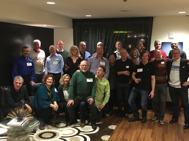 The ElseWare reunion, December 2015
Laurence Penney: Your company, ElseWare Corp. of Seattle, did some remarkable work on parametric fonts in the early 1990s. You must be pleased that variable fonts (as we now call them) are will soon be mainstream, with commitments from Adobe, Microsoft, Google and Apple.
Ben Bauermeister: Even at that time, back in the early 90’s, there were a few other technologies out there. Donald Knuth was of course working on Metafont at Stanford and part way into the Infinifont work Adobe announced Multiple Masters. There was also eventually Font Chameleon from Ares Software which was later acquired by Adobe but was never used, and finally Incubator Pro from Sampo Kaasila. Each was very different – but playing in the same space. Infinifont was the only one that was ‘programmatic’, meaning it had a development language and independent compiler.
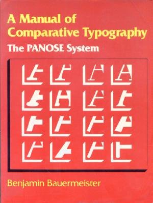
LP: The first work that I know you for is PANOSE, the font matching system that’s built into Windows and TrueType fonts. Can you tell me a bit about it? Do you think it’s still relevant?
BB: Back then resources on the computer were scarce – so substituting and approximating fonts was a handy space saver. There was also the issue of various vendors – Microsoft and Adobe for example – having very competitive libraries of similar designs – think Helvetica and Arial. PANOSE could bridge those divides and did so quite well without involving any trademarked names. Today it is still handy for that – but most systems have all those fonts loaded. The place where it can be most useful today is what it was initially designed for back in 1981 – the scenario of “Show me all the sans serif, bold, condensed, humanist, large x-height fonts on this machine”. That would be super handy.
LP: Was it always the plan that PANOSE ideas would develop into a parametric design system?
BB: Funny. Yes. The original book entitled A Manual of Comparative Typography: the PANOSE system included a sentence in the introduction that said “While this book can easily and quickly help you find a typeface that matches your specifications – it cannot create one for you. Maybe next year”. Even at that time I thought it was possible theoretically to do this – but it took the genius of Clyde McQueen to pull that off. Also, in a conversation with Ernie Brock of Ares Software – he said he took his inspiration from the same passage.
PANOSE 2.0 was what we called the ‘debucketization’ of PANOSE. Meaning that PANOSE 1 had a value say 1–10 for weight, with ‘5’ being Regular. PANOSE 2.0 had an exact function variable for the weight digit which was the stem height divided by the stem width of the uppercase H. This allowed for much more precise matching and later for synthesis.
LP: When I visited ElseWare in late 1994 I spoke to one of your designers, Karl Leuthold, about using the internal Infinifont design tools. I recall him telling me that it wasn’t particularly pleasant work for a type designer to tune the parameters to represent existing typefaces. Can you tell me more about how that process worked?
BB: Karl would have been using the Infinifont design tool we called Pecos. It was arduous work. Quite often, the designer would work through a concept at which point a software developer would need to be involved to ‘teach’ the engine routines – known as the Terafont – to do new tricks (think Q tails and ‘z’ feet). Once an improved version of the Terafont was released (updated nightly) the designer could hop back in and coerce the controls to produce the desired effects. This was not done with direct manipulation of curves, but rather with redefining parameters (known as Slams) in order to make the font appear correctly. Some work would happen very quickly – for instance we were able to produce the entire eastern European character set (Cyrillic and Greek) for the LaserJet’s 43 fonts in less than 3 months time – mostly because the western Latin parameters in the Terafont were easily adapted to the new glyph shapes.
LP: I recall that each font’s parameters and deltas, “Slams” as you call them, took up around 2 kB. That meant a “standard library” of several hundred fonts, intended to emulate various foundries’ revival collections, could be stored in a tiny amount of space. That was a large part of the appeal back then, wasn’t it?
BB: Yes, each font took only about 2 kB, but the engine that synthesized those fonts weighed in at about 700 kB. The solution we built generally was capable of providing 120 fonts with an extended character set and robust TrueType hinting for under 1 MB. Of these 120 faces, 43 of them were what we called Replica Faces, meaning they matched curve for curve and metric for metric the faces that HP was shipping in the LaserJet printers. There were 8 original designs by Karl and Kathy Shinhofen (Graphos and Strider). The additional 71 faces were re-renderings of known designs (LaserWriter 35, common OS faces, and well known library favorites). These faces matched the metrics but did not fully adhere to the orginating design – ‘improvements’ were made. They were all shipped with alternate names, but used the PANOSE matching system baked into Windows to act as substitution fonts if a call for, say, Palatino was made by a document and no such font existed on the system. Pretty cool.
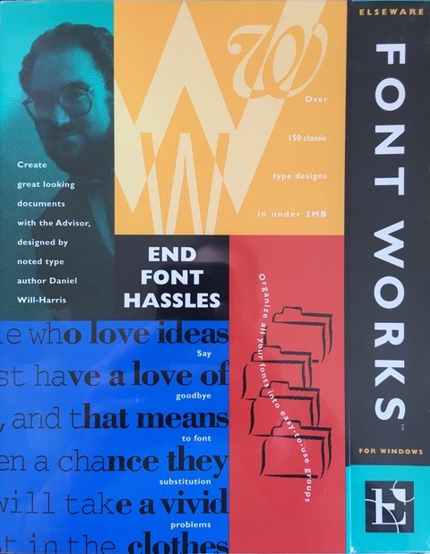
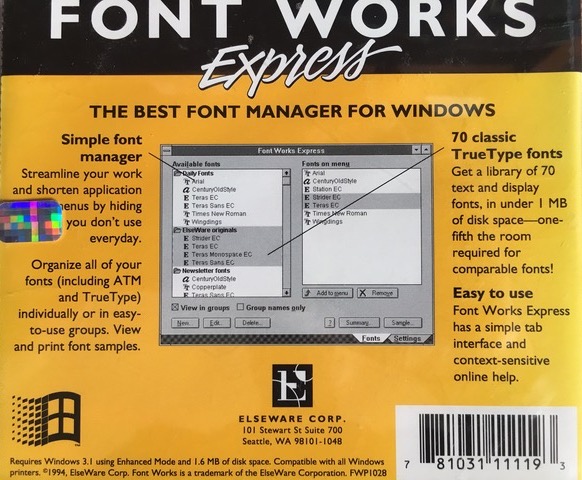
LP: Back in 1994 you gave me a copy of Fontworks Express, a font system enhancement for Windows based on Infinifont. Can you describe what it did?
BB: There were two commercial product packages that we took to market: Fontworks and Fontworks Express. The latter had the great feature of being able to diminish your font menu down to only the fonts you regularly use to author new documents.
Your remaining library, plus about 70 fonts, would be installed temporarily on demand when a document made a specific request (or matching request) for an unavailable font. This was a feature that Microsoft threatened to put directly into the Windows system, spooked our investors, and the product died even before Microsoft ever followed through. It would still be a great, great feature. I hate having a font list that’s 2 miles long when usually all I need to get to is Minion.
LP: It’s worth noting that, 22 years on, the remarkable space-saving potential of parametric fonts is a key reason for their revival. Google is particularly interested thanks to the promise of less webfont bandwidth (what’s good for the web is good for Google), and Apple still cites these benefits when talking about embedding fonts in their mobile devices. Back to the story, Infinifont was acquired by Hewlett-Packard, wasn’t it, with the intention of embedding it inside their printers?
BB: The company, ElseWare, was acquired by HP in late 1995 (the old team just got together for a 20 year anniversary party last December). This was not with the ‘intent’ of embedding – we had been the embedded technology for nearly a year at that point. HP purchased the team for several reasons: to reduce their royalty load, to use the technology in inkjet printers, and to re-task the engineering team on to solving larger document portability problems (which, really unfortunately, never materialized). Infinifont remained the main rendering engine for the heyday of LaserJets for about 7-8 years. The technology saved them close to $100 million in royalty and memory expenses.
LP: Wow! Amazing to put such a figure on the benefits of variable fonts.
BB: Yes, and now with nearly unlimited processor power and storage, the benefits of Variable Type are equally great. A website can include a single payload for a font family and use all of the variants in its design with very little impact to the user. This will also be great for smaller devices that wish to provide a rich user expression without clogging system resources.
LP: So what have you been up to since? Are you still into typography?
BB: I currently do consulting for Amazon. Scott Boggan, who is the Creative Director for device interfaces at Amazon was our Creative Director at ElseWare back in the day. He gave me a call when they started to do visioning work on their new typefaces and I have since been involved with the creation and implementation of their two new faces, Bookerly for Kindle reading and Amazon Ember for use across their various operating systems as the default OS face.
LP: Many thanks for this insight into what was happening with variable fonts all those years ago.