Blog posts
Demo: Resize textbox with variable fonts (aka Fit-to-Width)
Posted 24 November, 2016
To kick off the DEMOS section at Axis-Praxis, we’re showing how one of the simplest operations in graphic design — resizing a textbox — can be improved with variable fonts. Try it here:
Axis-Praxis Demo #1: Resize textbox

It’s deceptively unspectacular, so an explanation of what’s going on is in order.
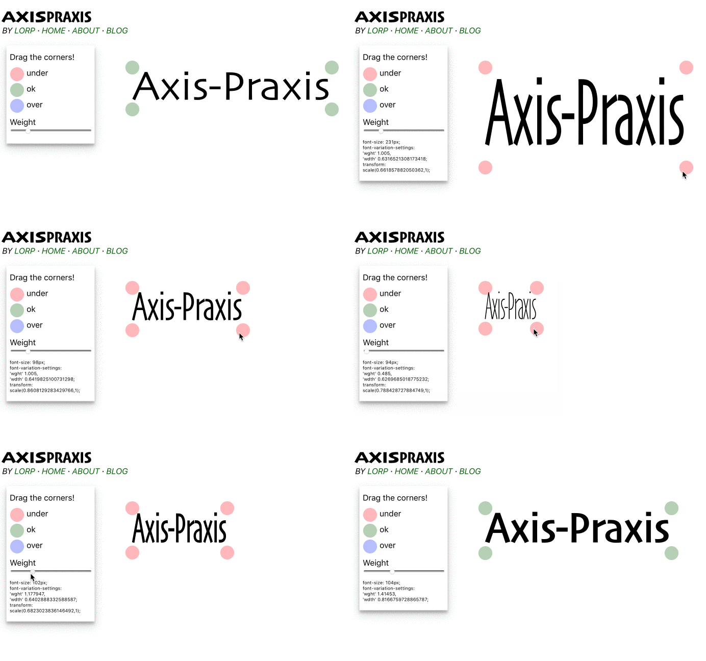
First try the demo in a non-variable browser: normal Safari on macOS is best, since that setup has the Skia font. The textbox is designed so that the text stretches to fit the width and height available, as you drag the corner handles. If the textbox changes height, the font size changes to suit. If the textbox changes aspect ratio, the font stretches in the x-direction to fit. All fairly predictable — and as all designers know, not a good way to adjust text since the font is being distorted. Note the colour of the corner handles, though. They’re red if the font is being scaled by a factor < 1, and blue if the font is being scaled by a factor > 1. If you’re extremely precise, you might be lucky enough to get back to the green corners that you started with, which indicates no distortion.
Now try the demo in a browser that understands variable fonts, such as WebKit Nightly or Safari Technology Preview.
We’re using Skia, which has weight and width axes. Leave the Weight axis alone for the time being.
As you move the textbox handles, the font size and the font’s
wdth setting are adjusted to make the text fill the textbox. You’ll notice that the font looks much better than in the non-variable
browser. Skia’s wdth axis goes from very narrow to very wide, so the corner handles remain green for a large range of aspect ratio.
When you create a rectangle that cannot be filled using font variations alone, the old horizontal scaling method kicks in: for textboxes
wider than the font can manage happily, we lock onto the maximum wdth and scale by a factor > 1; for textboxes narrower than
the font can manage, we lock onto the minimum wdth and scale by < 1. As before, the handles are red if we are scaling by < 1, and blue if > 1.
Next, try adjusting the weight using the slider. Normally when you adjust Skia’s weight, the width also changes: its metrics
are not static along the weight axis. In this demo, however, the overall width does not change. Instead, a new wdth setting
is calculated on the fly, just as if we had adjusted the corner handles and needed a new wdth setting. The result looks remarkably as if Skia’s weight axis
has static metrics. You may also notice that as you adjust the weight axis, the handles change colour. This means that we are going
beyond the font’s ability to cope with the adjustment using the wdth axis, and we have to scale.
One really nice thing about the results in the red and blue zones is that, since we are working with a font with a large range of wdth, it’s
nowhere near as bad as if we were stretching the regular width.
How does it work? The important thing to recall is that variable axes do not scale linearly, regarding the width of their result.
Even if glyphs have just two masters each (or, in GX terms, each glyph has one set of gvar deltas),
the rate of change will vary between glyphs: the M will get wider faster than the I. The precise value for wdth, that would
generate the desired textbox width,
is in fact rather difficult to calculate. Therefore we must estimate it. We do this by rendering and measuring the text multiple
times, each time with a different wdth setting. We give up after we’ve spent the time we allocate for the purpose. We don’t want to
spend much time doing it, as we need to perform this multiple render-&-measure every time the mouse is moved a fraction. This means we
need an efficient search algorithm too — we don’t want to evaluate dozens of renderings that are far away from the ideal. Binary search is the
natural choice. We give up after a given number of iterations, or when the value is known to be within a very small range.
Fewer iterations would make the UI faster, but less accurate. A good balance turns out to be 15 iterations: it’s visually very good, and acceptably fast.
You might be interested in what happens in the CSS as you drag the handles, so it is echoed in the UI. Note when the scale kicks in, and watch how the wdth value changes as you adjust the weight slider.
So it’s all rather unimpressive if you don’t know what’s going on. It’s not supposed to look amazing. It’s supposed to look like how the letters would have been designed to fit the space.
Finally, you can try editing the text in the textbox. The wdth axis changes to suit, and the scale kicks in if necessary.
This aspect is a little bit buggy, but it’s interesting enough that I left it active for people to try.
I expect this kind of functionality to be useful in situations where you need to fit text to predefined boxes, without adjusting the font size. This was explored in 2014, using a family with lots of width variants, by Nick Sherman and Chris Lewis at Font-to-Width.
The new DEMOS section at Axis-Praxis will showcase applications of variable fonts, both serious and fun. Contact me if you have an idea for a demo, or a demo ready to run that you’d like to be hosted at Axis-Praxis.