Blog posts
Research: Versatile fonts by Baptiste Guesnon
Posted 28 November, 2016
This is a guest post by Baptiste Guesnon, who has been doing some very interesting research with the width axis along similar lines to the Axis-Praxis resize-textbox demo.
By 2015 the question of responsiveness was everywhere — responsive web design was widespread, the dream of responsive fonts was recurring — yet no solution existed for using variable fonts in browsers. At the same time some great tools had been created to enable the manipulation of fonts with JavaScript.
One of them is Plumin.js, an open source tool by the team behind Prototypo (whom I thank for their help), released in November 2014. It allows the manipulation and generation of fonts live in the browser. With this tool, it was now easy to generate different interpolation instances from one or more master fonts. I created a JavaScript tool on top of it to make any interpolation-ready OpenType font variable.
 How to use fake variable fonts using Plumin
I started my enquiries by creating different proofs of concept that would highlight how making fonts variable would change the way that designers can play with text.
One really simple, but nevertheless revolutionary (for me) use of variable fonts, is to allow the text to fit to the width of its container. From the graphic designer’s perspective it was disappointing that such a simple thing was not easily possible in dynamic interfaces.

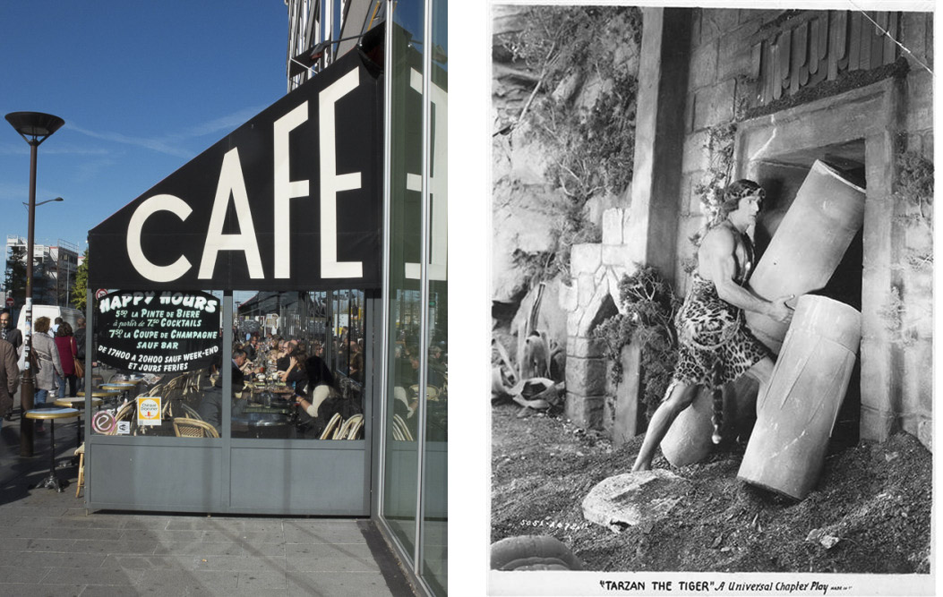
Left: Example of lettering fitting font width and height. Right: Man fitting a non-variable font into a variable space
Here’s a simple example of use with a live feed of French newspaper headlines fitted to the size of the screen.A #variablefont that automatically adjusts itself to the space ascribed pic.twitter.com/dkKXjMgrQ8
— Baptiste Guesnon (@Ba_Gsn) 17 October 2016
 *Multi-screen live feed of French newspaper headlines fitted to the size of the screen* My experiences with font variations also highlighted their limits.It fits! #variablefonts pic.twitter.com/ouIJZ2qlU8
— Baptiste Guesnon (@Ba_Gsn) 10 October 2016
From these first experiments a question came really early to my mind: what if we could justify a text without changing the whitespace between the words but rather adapting the drawing of the glyphs? And what if this justification was not straight? And moving?When playing with the limits of #variablefonts, the fallback to the homothetic transformation looks harsh... pic.twitter.com/KS3cDTuaGn
— Baptiste Guesnon (@Ba_Gsn) 11 October 2016
Beyond the wow effect, these questions raised a lot of new problems like: how to calculate the line-breaks if the font can vary? Does the choice of a precise width-axis value for a text still make sense? If not, how can this choice be automatic? These questions are still valid today. Of course variable fonts bring possibilities much more than just fitting a text to its container. It could for example make it possible to change the optical size type according to the context, or changing the font parameters for accessibility issues, etc. Here is an experiment where the contrast and the boldness of the text change with the distance of the reader.Waving my #variablefonts in chrome :-) pic.twitter.com/hvd1pn8WVG
— Baptiste Guesnon (@Ba_Gsn) 9 October 2016
I did these experiments in June 2016. In mid-September during the ATypI conference the new OpenType 1.8 format was released — to my surprise and delight. Nevertheless a technology like Plumin.js has still a big advantage on its side: it makes fonts variations possible on non-compatible browsers by handling 100% of it with JavaScript. That’s the reason why my demo works just as well on current versions of Chrome, as on Safari or Firefox. And even if this new font technology is proceeding amazingly quickly on Safari, for example, its use in production will require a fallback solution for some time. I tackled many of these questions in my master’s thesis *[Caractères versatile](http://baptisteguesnon.eu/thesis/Baptiste_Guesnon-Caracteres_versatiles.pdf)* (written 2014–2016 at [ÉSAD Valence](http://www.esad-gv.fr/fr/)) in which I wondered: *How contemporary typographic practice revives the question of dynamic typefaces? Why doesn’t dynamic typeface technology exist already? How do we get there?* by looking at the history of type through the spectrum of the variation of glyphs in typography and the failed attempts to democratise this technology.What if font size and optical size of #variablefonts automatically adjusted to the distance the eyes to the screen? pic.twitter.com/efrxk9ha5c
— Baptiste Guesnon (@Ba_Gsn) October 13, 2016